Data
Wildlife populations are being destroyed by us at a rate unprecedented in history.
Introduction
The Living Planet Index (LPI) measures the average change in the number of individuals across the world’s animal populations. A ‘population’ is defined as a species within a geographical area. The global LPI value in 1970 is indexed at 100% and this has fallen to 32% in 2016, signifying a 68% decline. It tells us that between 1970 and 2016, on average, there was a 68% decline in population size across the 20,811 studied populations.
Data Visualisation
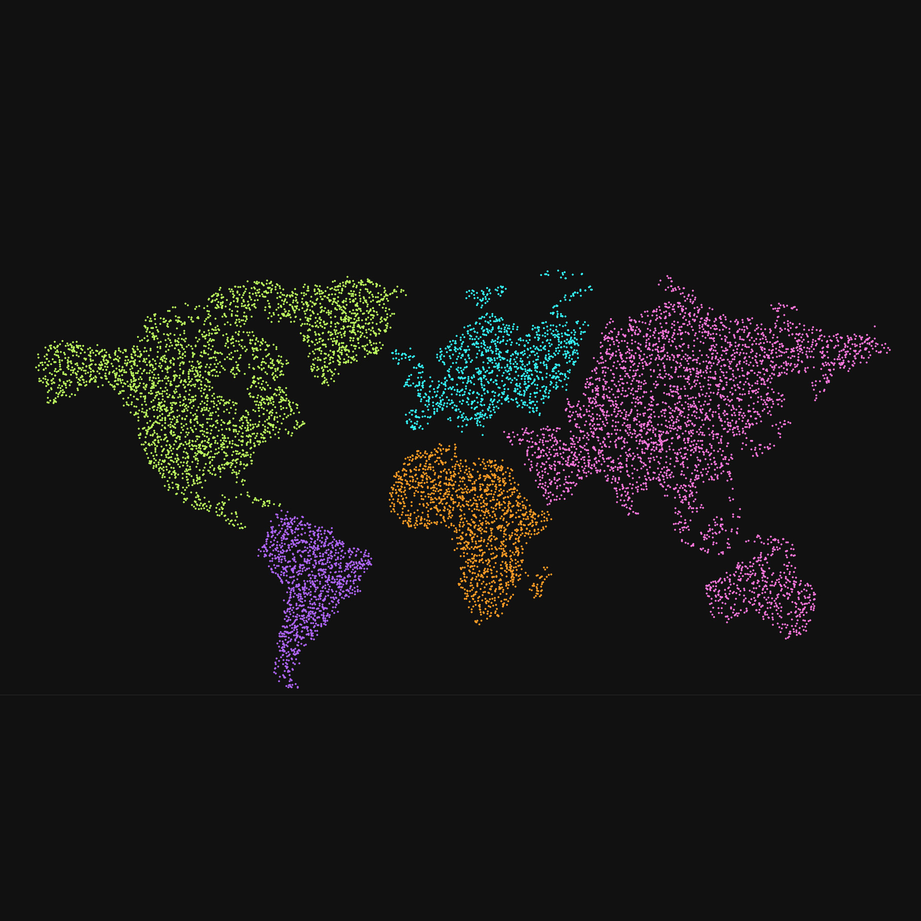
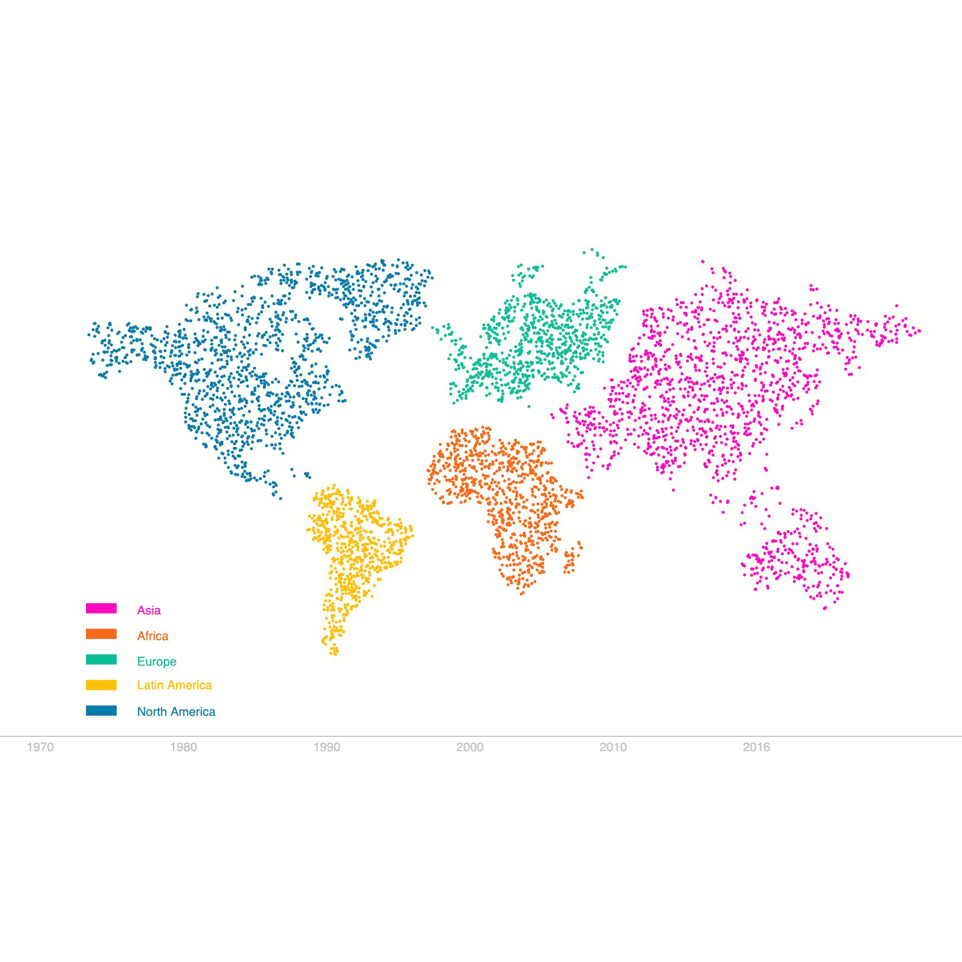
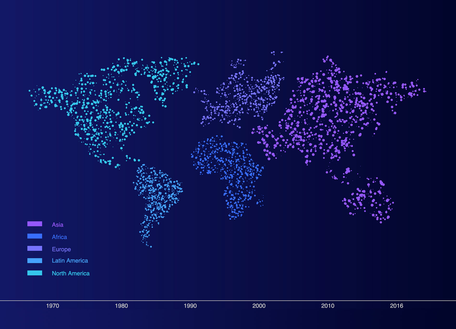
The data is visualised through a map using population density as a way to portray the LPI percentages in a visual format. Each continent is made up of ellipses that represent the wildlife population present in the region. As the user moves the mouse across the screen, the map displays the changes in widllife population density across the different years. We can see from the map visualisation some continents are less dense while others are much more crowded with ellipses, which provides a distinct visual comparison between masses from different parts of the world.
Hover over the graph and hold down the mouse to reveal the Living Planet Index values for each continent
Findings
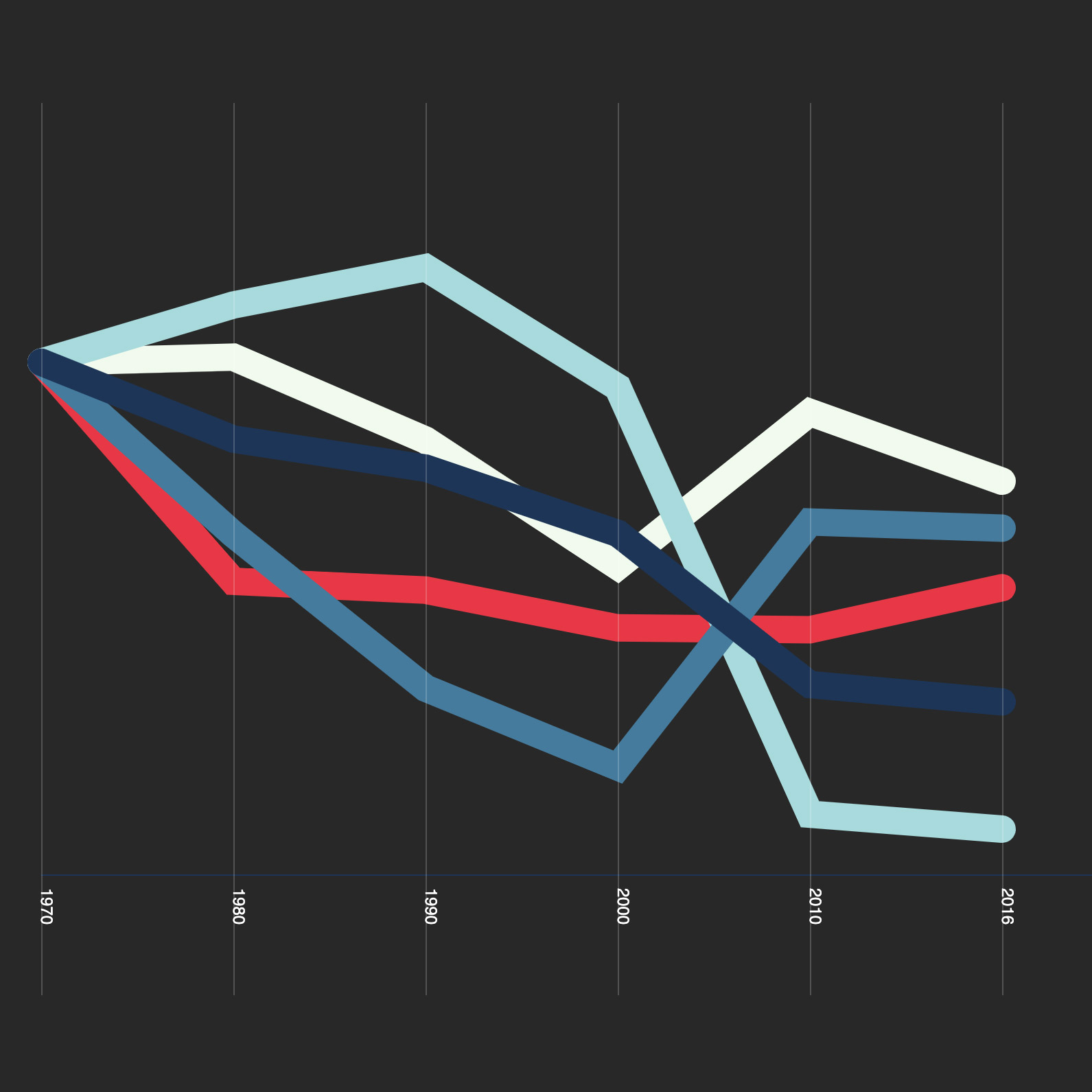
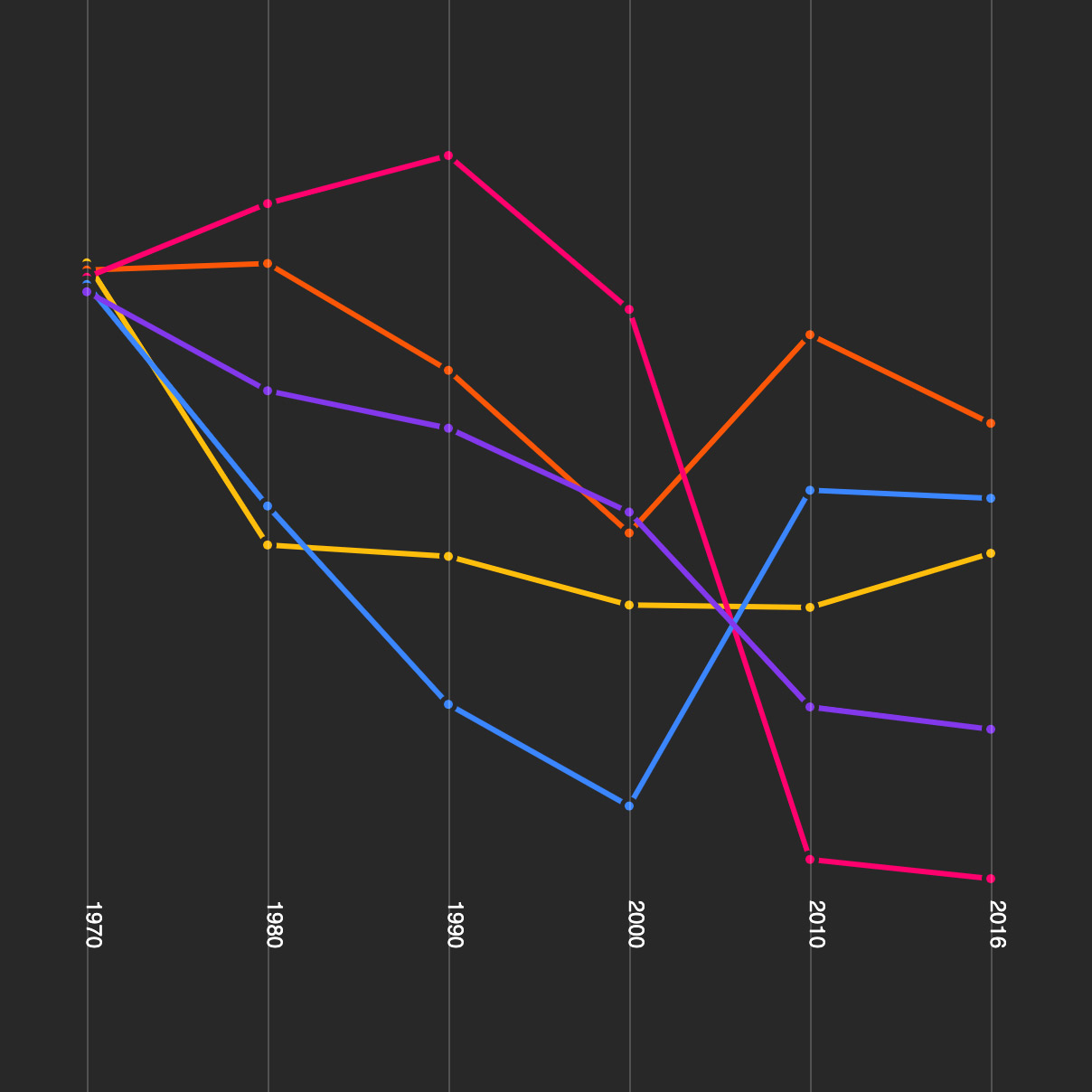
In the above line graph, we see an overview of the data from 1970 to 2016. The LPI value is indexed at 100% for all continents in 1970, and any value above or below 100% would signify an increase or decrease respectively. Latin America has seen the most severe decline of any region. It experienced an average decline of 94% across its studied populations. For North America, it experienced a steady average decline of one-third (33%) through the 1970s, 80s, and 90s. In fact, the average trend has slightly increased after the millennium.
Africa is the only continent with a significant number of large mammals left. Unfortunately, it has seen a dramatic decline of two-thirds (65%) since 1970. Europe has seen the smallest decline of all of the continents. An average decline of 24% since 1970. This paints a less severe picture for biodiversity in Europe and is attributed in part to successful conservation efforts. For Asia-Pacific, it has experienced an average decline of 45% since 1970. But there is a slight change in trend in 2010, with the average slightly increasing.
Supporting Data Visualisation
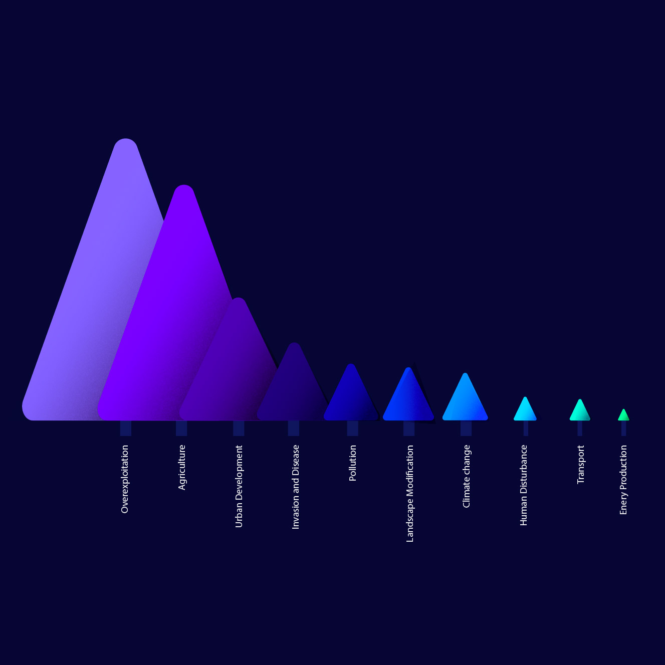
Data on threats to wildlife is being conceptualised based on a bar graph. The data is visualised through an illustraton of barren trees against a scenic background. This illustrated graph reflects the effects of threats to wildlife species. The biggest threats like Overexploitation and Agriculure are the leading drivers to deforestation and loss of habitats. Hence, the graph portrays the catergories of different threats in the form of barren trees to symbolise the devastating effects of these threats.
Findings
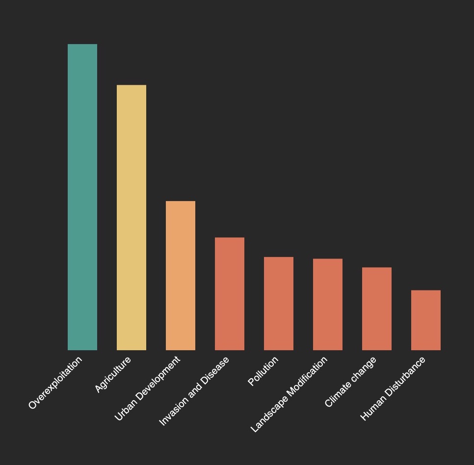
Overexploitation and agriculture were responsible for 75% of all plant, amphibian, reptile, bird and mammal species that have gone extinct since 1500 AD. In fact, it has been driving mammals to extinction for a millennia. Overexploitation is the still the biggest threat till today. Nearly three-quarters (72%) of the studied species – that’s 6,241 oout of 8,688 of them – were under pressure from hunting, fishing or logging of forests.
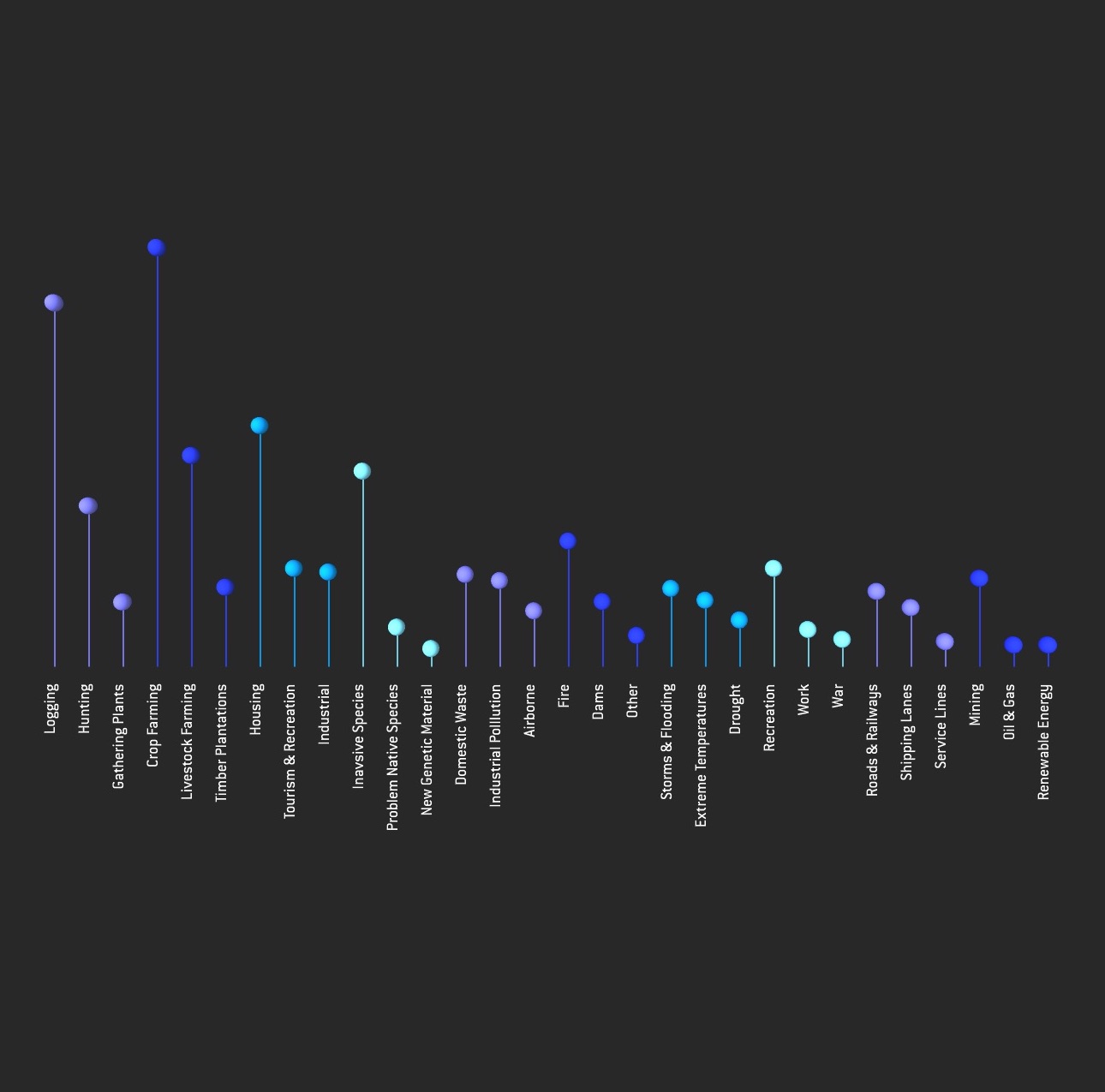
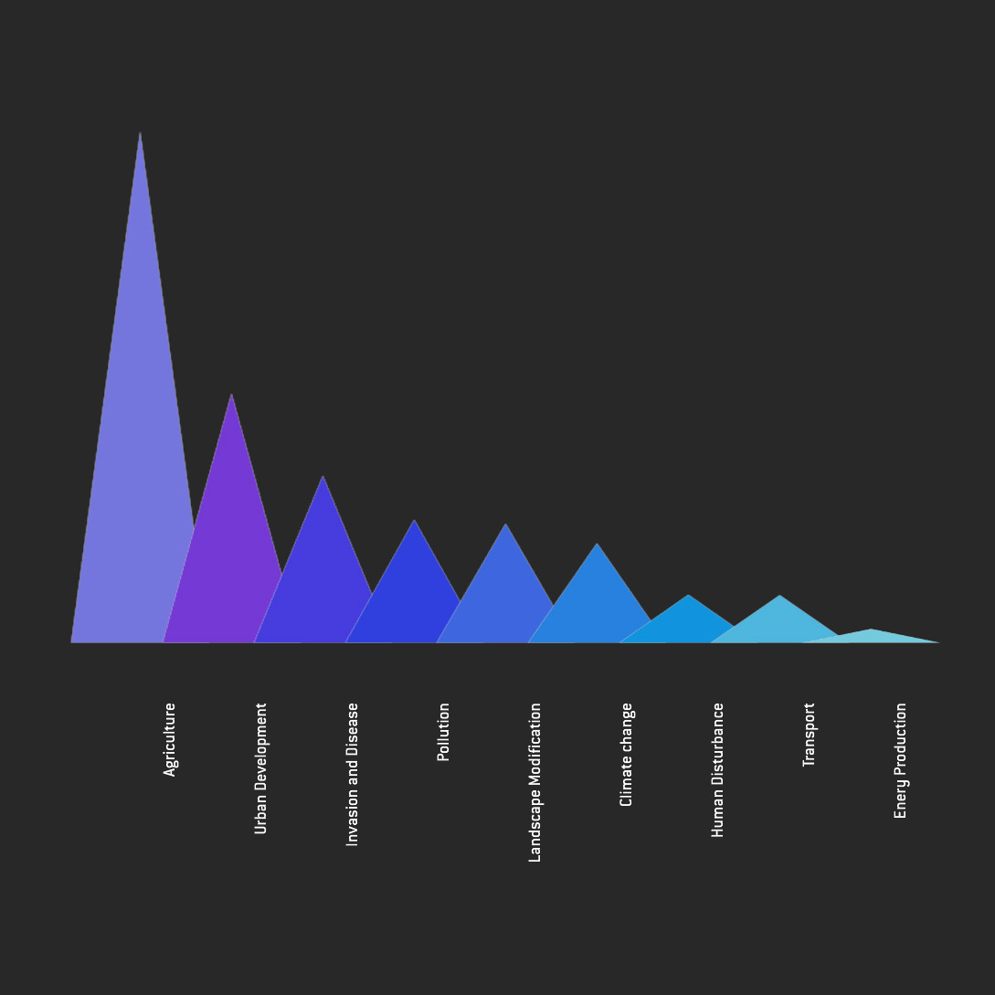
Agriculture – which includes arable farming, livestock, timber plantations and aquaculture – was also a massive threat, affecting nearly two-thirds (62%) of the wildlife species. Furthermore, the sum of all affected species in the graph adds up to greater than total of 8,688 species that were studied. This is because more than 80% of wildlife species are at risk to more than one of type of threat. For instance, species that are affected by Urban Development are also under the threat of Deforestation and Agriculture due to the clearance of land for infrastracture development.
Insights
The wildlife population is rapidly decreasing, as we see from the map visualisation, the density of each region is getting sparser as the years go by. Although there are some increases in population change for certain continents like Europe, most continents experience an average decline in population change. In the case of Latin America, as we see in the map visualisation by the end of 2016, the whole continent is barely recognisable, with only a few ellipses left to mark out the shape of the continent that was once there. This symbolises the disastrous effect of such change in the wildlife population. The decline in wildlife populations are further accelerated by the expansion of human activities such as demand for land and food. Humans only account for 0.1% of the total biomass on Earth, but because of our actions, we are driving the Earth's wildlife population of 0.4% - four times the collective human biomass- to extinction. The devastating consequences of wildlife populations disappearing reflects the dying state of our planet as well.
Conclusion
Although some continents experience a slight increase in wildlife populations in recent years, the average decline is still larger than the increase in wildlife population, signifying an overall loss in populations as compared to 1970. Hence, it is important to raise awareness and start engaging in conservation efforts that will help reverse this declining trend.
Process
Map
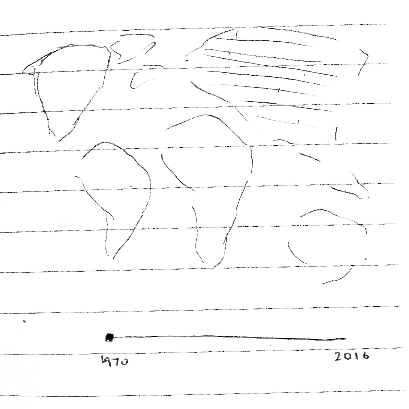
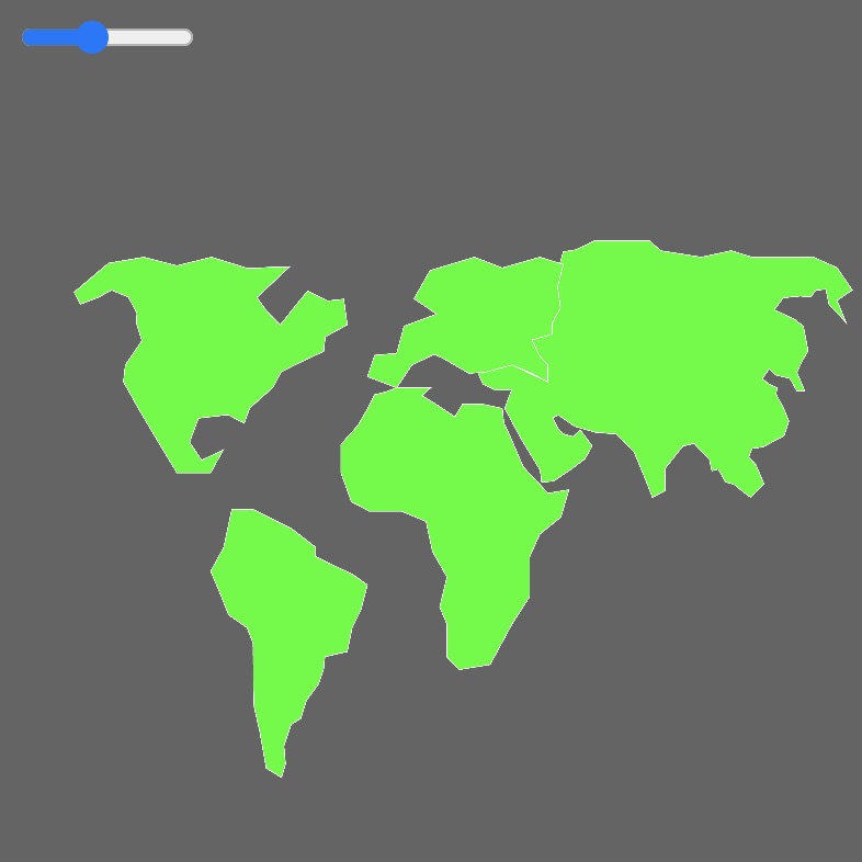
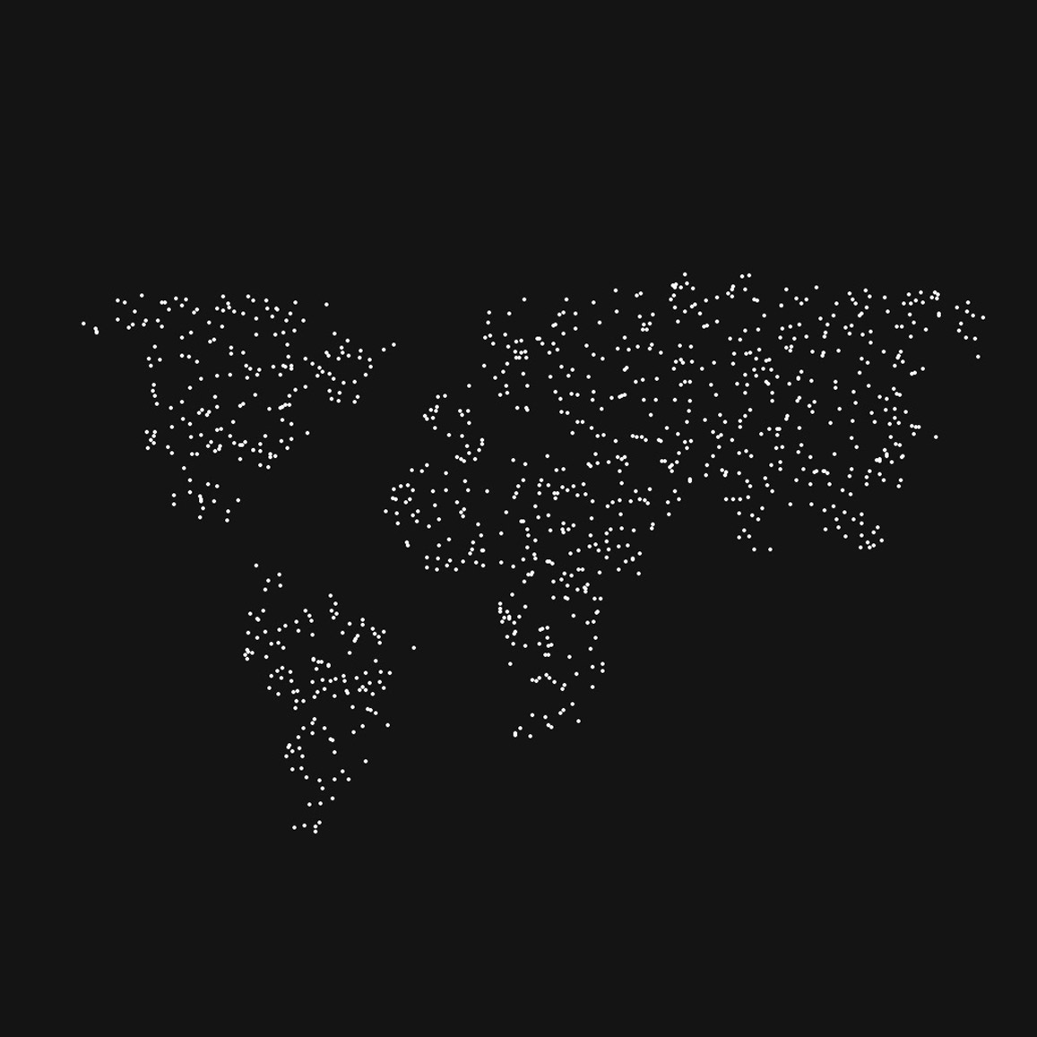
Some development sketches and drafts of the map graph. Initially, I had intended for the user interactions to be controlled by a slider bar. Along the way as I learnt more about user interactivity through coding, I discovered various ways I can go about creating similar effects without the use of the slider. In the next drafts, I started experimenting with the mouseX function which enables users to control the map by moving their mouse across the screen without having to click a button or drag a slider. In addition, instead of presenting the changes in wildlife population through colours, I transformed the solid shapes of the continents into ellipses that form the general outline of the region, which helps to convey the concept of population density to represent the values instead.
Line Graph
Here are some drafts of the coded line graphs. Tried a few explorations of line graph styles and colour palettes to effectively display the data points of each continent clearly.
Threats To Wildlife Graph
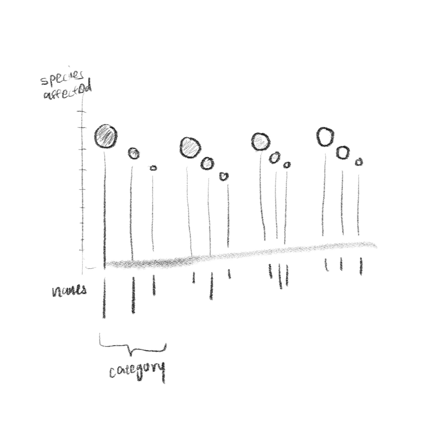
These are the other ideas I had for the supporting data visualisation on Threats to Wildlife. I explored a few visualisations for this dataset, from regular bar graphs, to illustrated ones. For the supporting graph, I experimented with different methods to interpret data in a bar graph. From consultations I realised that my initial drafts lacked linkage to the theme of wildlife, hence that was an issue I needed to address in my data visualisation. Through the data analysis, I found out that the loss of habitats was one of the largest drivers of wildlife species extinction. The forest is home to many wildlife species thus, I wanted to connect my visualisation to wildlife by portraying deforestation through the use of barren trees to represent the bars of the graph.
References
- Almond, Rosamunde and Grooten, Monique. Living Planet Report 2020 - Bending the curve of biodiversity loss. WWF, 2020.
- Ritchie, Hannah and Roser,Max Living Planet Index. OurWorldInData.org, 2021.
- Ritchie, Hannah and Roser,Max Threats To Wildlife. OurWorldInData.org, 2021.